ANTHOS SEEDS
Anthos Seeds is inspired by the slow, intentional process of growing. For this branding redesign, I focused on creating a visual identity that feels organic, warm, and trustworthy—drawing from Vermont’s natural textures, muted color palettes, and the simplicity of seed-to-soil storytelling.
Design Breakdown
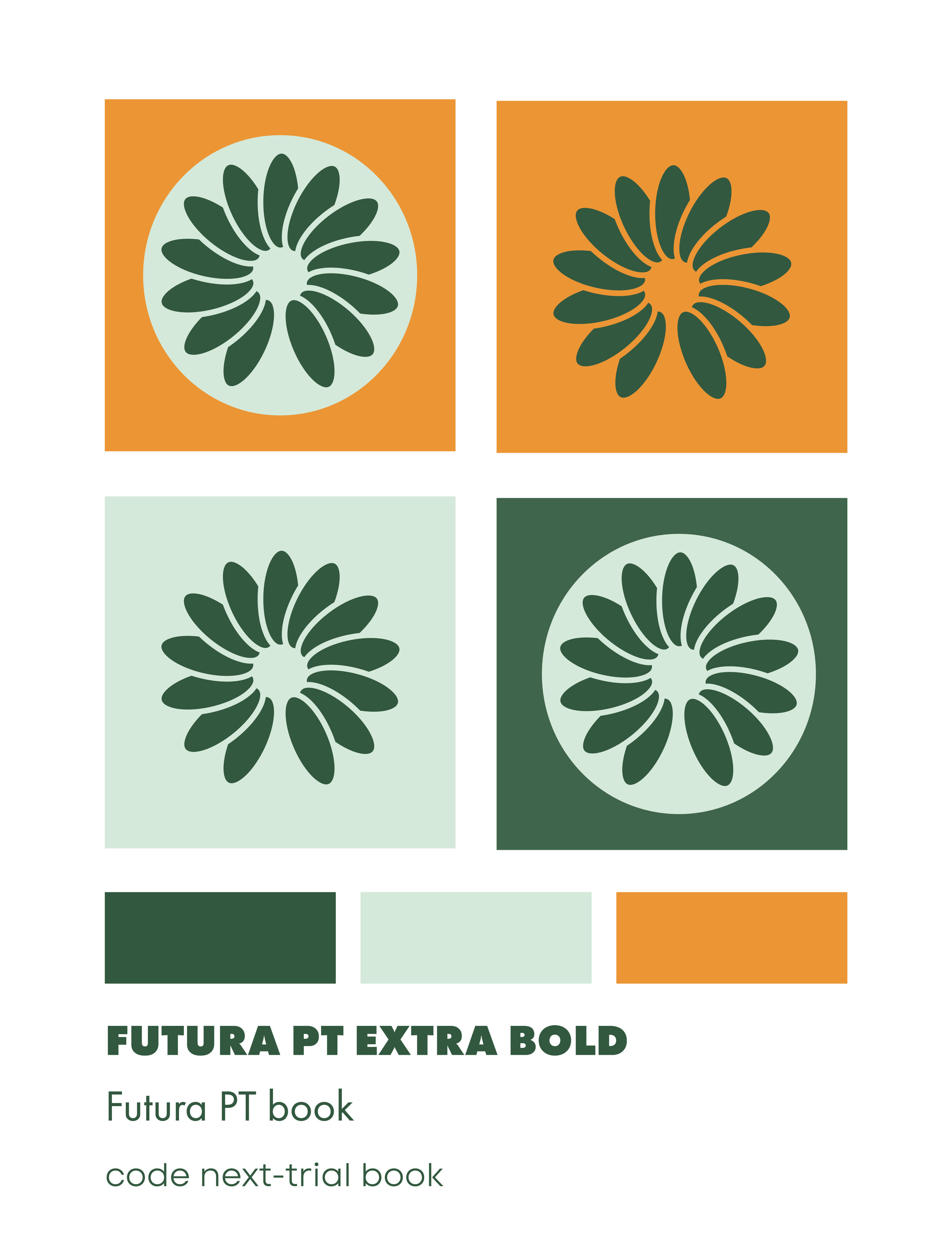
The redesign for Anthos Seeds was rooted in honoring the brand’s original identity while giving it a refreshed, contemporary feel. The new logo features a circular pattern of repeating seeds, echoing the form and symbolism of the original lotus flower mark. This repetition represents growth, cycles, and continuity—core values of seed saving and sustainability.
The color palette draws from natural earth tones, combining rich orange and deep green with a softer light green to evoke warmth, vitality, and trust. A modern sans-serif typeface was chosen to balance the organic elements of the brand, bringing clarity and a clean, modern sensibility while maintaining a grounded, approachable presence.
Make it stand out
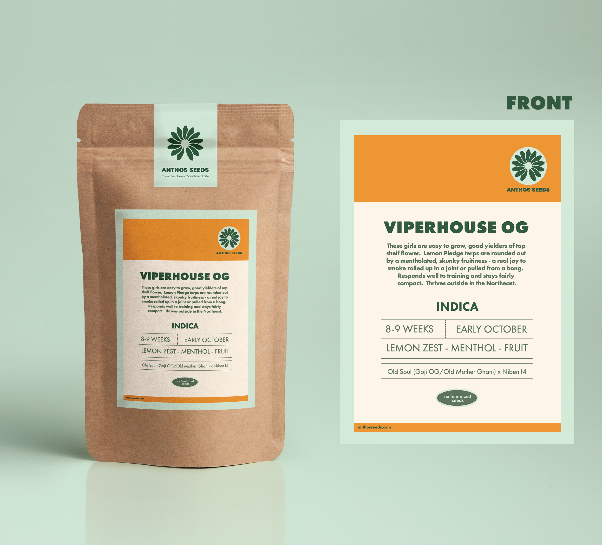
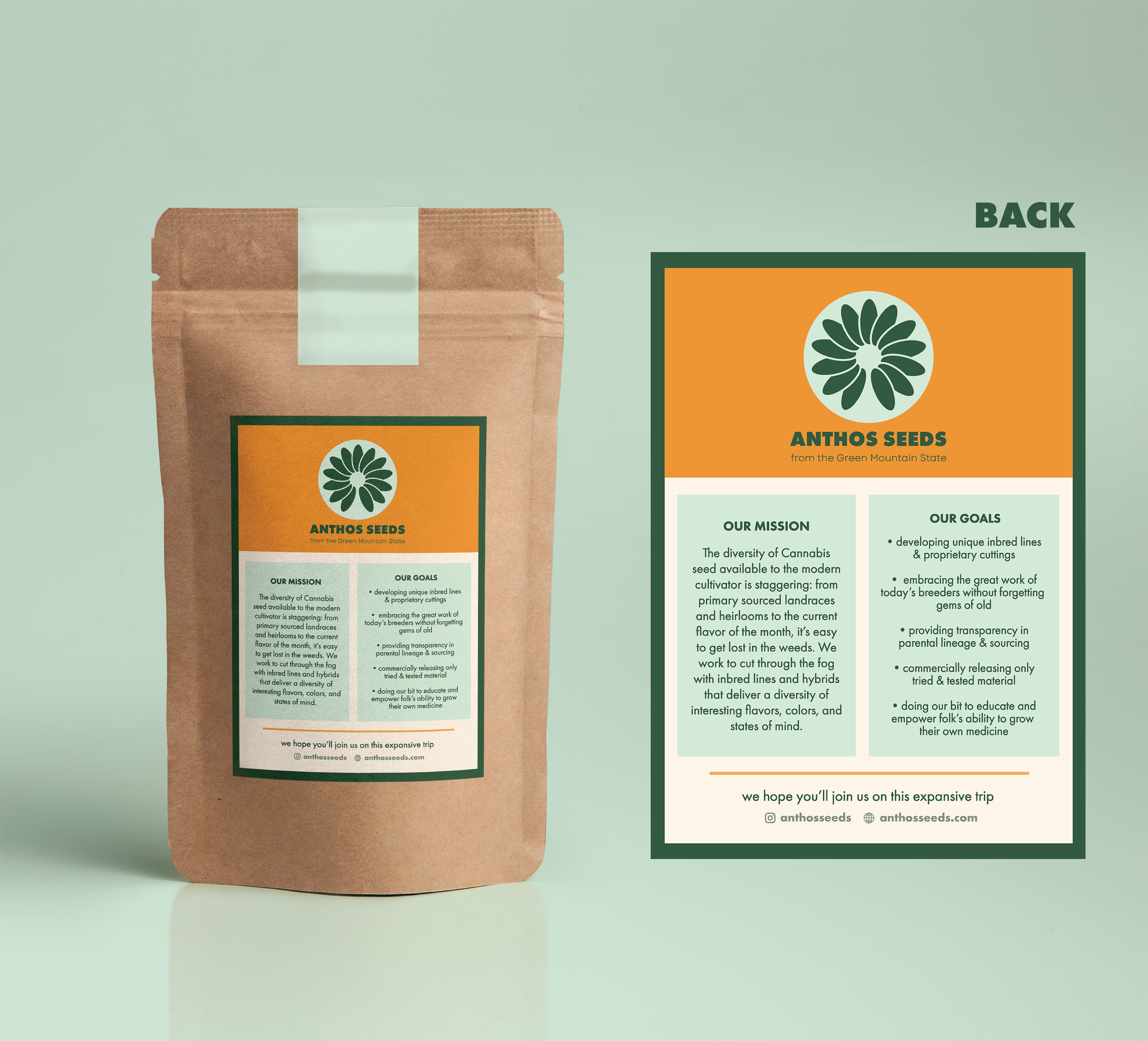
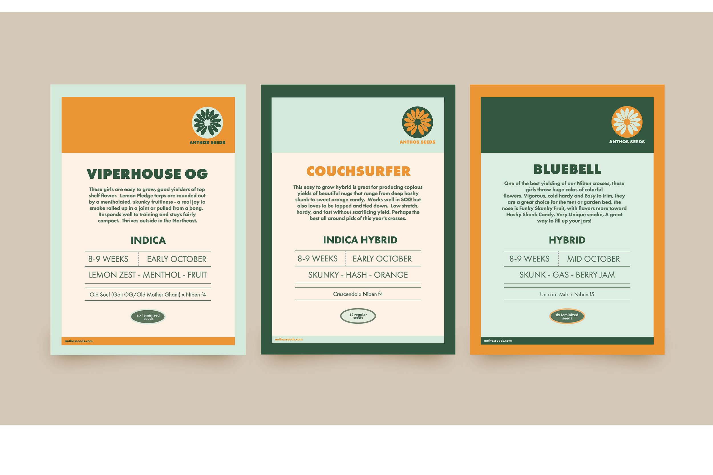
The label design prioritizes clarity and structure while remaining visually engaging. Information is organized in a clean, readable hierarchy so key details are easily accessible at a glance, building trust with the consumer. The structured layout is balanced with thoughtful use of color and typography to keep the design warm and inviting—appealing to gardeners and growers who are looking to invest in high-quality, thoughtfully sourced seeds.
Packaging Approach
The seed packets are presented in kraft-toned, recyclable bags to reinforce Anthos Seeds’ commitment to sustainability while maintaining a polished, retail-ready appearance. The natural material signals quality and environmental responsibility, while the clean, intentional label design ensures strong shelf presence and easy recognition. This balance of professionalism and approachability helps the product feel trustworthy and elevated, appealing to customers who value both thoughtful design and responsible sourcing.